

ALT UCW
Collaboration for London New Designers
Main roles: Web design and Social Media


WHO?
ALT was our collective class brand for my final year of University. Every year, the BA Top-Ups work collaboratively on a brand that represents us at the London New Designers, and a chosen message or theme. This year, rather than choose a stylistic theme as the main subject, we wanted to put the spotlight onto us as individuals and on our work - mainly our projects for social impact.
WHAT?
The brand had to represent all of our alternating styles, becoming quite a minimal backdrop rather than overpowering the projects we were bringing to the show.
At the beginning of the academic year, the class separated into smaller groups where we conceptualised what we wanted our show to be. After putting together a mind map, each group presented their ideas to the class. The one consistent idea each group had, was to let our projects shine, with the class brand supporting it, rather than being the main focus. The main idea my group pitched (among other potential ideas) was called "Spotlight", in relation to our social impact projects putting the spotlight onto serious and important subjects.
Ultimately, we took small ideas from each group, and the name "Alt" from another, which focused on our difference in perspectives and the alternating perspectives and experiences audiences have about design outcomes.
ACTION. CHANGE. AFFECT.
Together, we bounced straplines back and forth, to conjure the Alt brand's rallying cry "Action. Change. Affect".
Action - the activity of developing ideas, researching and experimenting, bringing attention to deserving causes.
Change - to create a change in the system.
Affect - presenting solutions to social issues, affecting the ideologies or structures surrounding the topic.
This describes the flow of the design for social impact project.
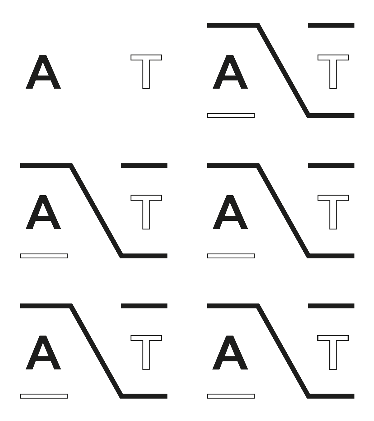
I did not design the logo (above), which was inspired by the Alt key, to action a change, but I experimented with animating it to liven it up. A simple, swift forward motion creates an energetic vibe, whilst serving as an (aesthetics only) eye-catching loading symbol for the website I designed - seen when accessed by mobile device.
Moving things forward for positive change in society.